
Hi all,
I'm evaluating DAI for use with a manufacturing data collection system, and so far have been quite impressed. One reqirement I'd like to satisfy is the display of machine runtime charts based on limited numbers of data points. For example, the last hour/shift/day from data at 1 minute intervals.
I have no problem displaying the data with DAI, but haven't been able to configure a simple line graph representation. The data is essentially raw, from a simple timestamp limited view of a base table. All of the graph documenation I've found relates to more sophisticated cross-tab data tables.
So, I'm hoping simple line graphs of relatively raw data can be presented within DAI. Hopefully I'm missing something basic. Any advice will be appreciated.
Regards,
Greg Shearer
Simple line graph - how to?
Moderators: Bob Cergol, Data Access, Cintac
4 posts
• Page 1 of 1
Simple line graph - how to?
![]() by shearerg » Wed Aug 13, 2008 1:42 am
by shearerg » Wed Aug 13, 2008 1:42 am
- shearerg
- Posts: 62
- Joined: Wed Aug 13, 2008 1:04 am
- Location: Newcastle, Australia
Simple Line
![]() by Mikkel Jensen » Wed Aug 13, 2008 2:21 pm
by Mikkel Jensen » Wed Aug 13, 2008 2:21 pm
Hi Greg
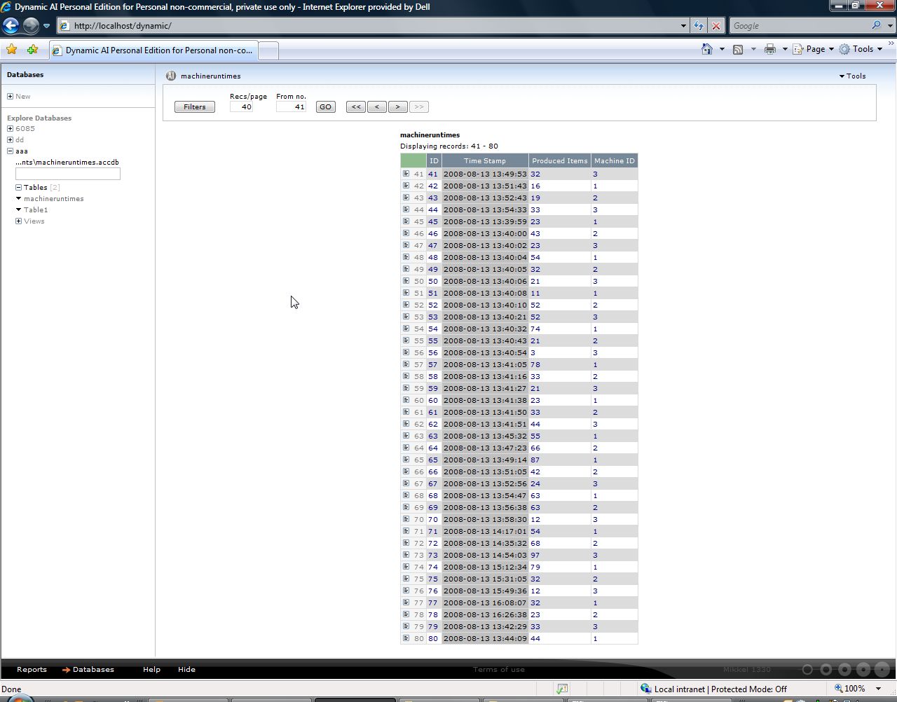
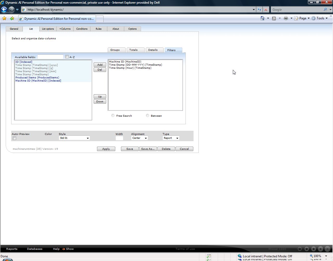
I have created a sample table holding information of timestamp, machine ID and number of produced items.
The table looks like this:
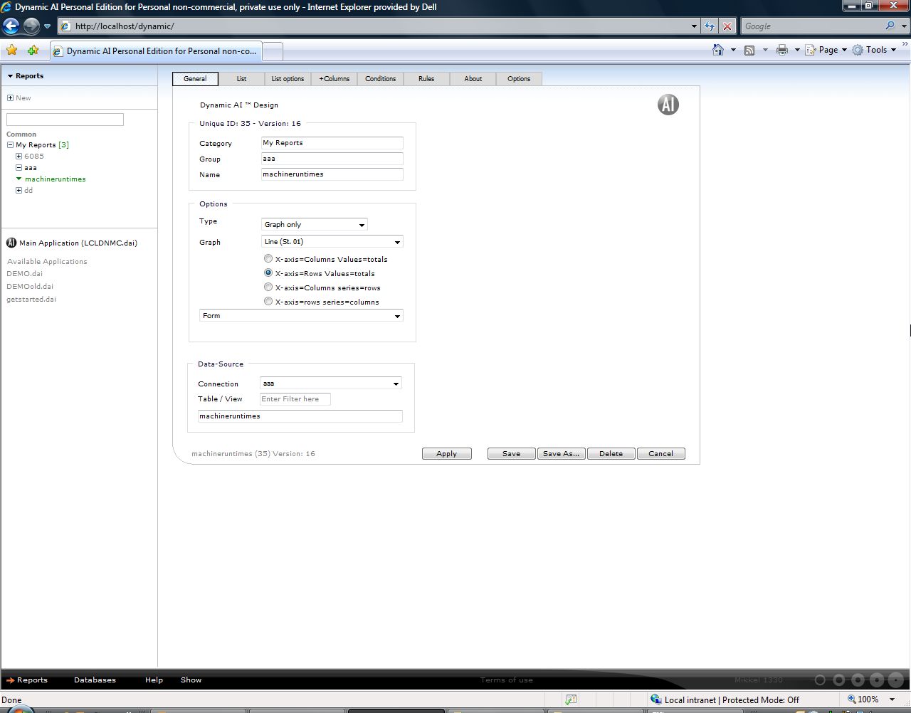
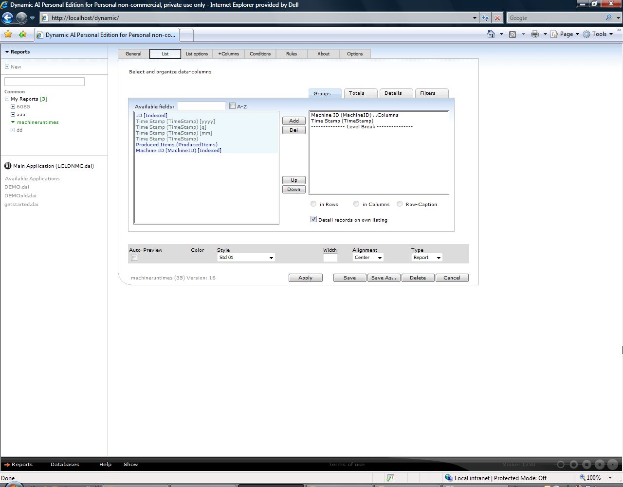
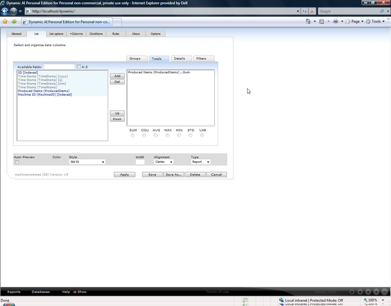
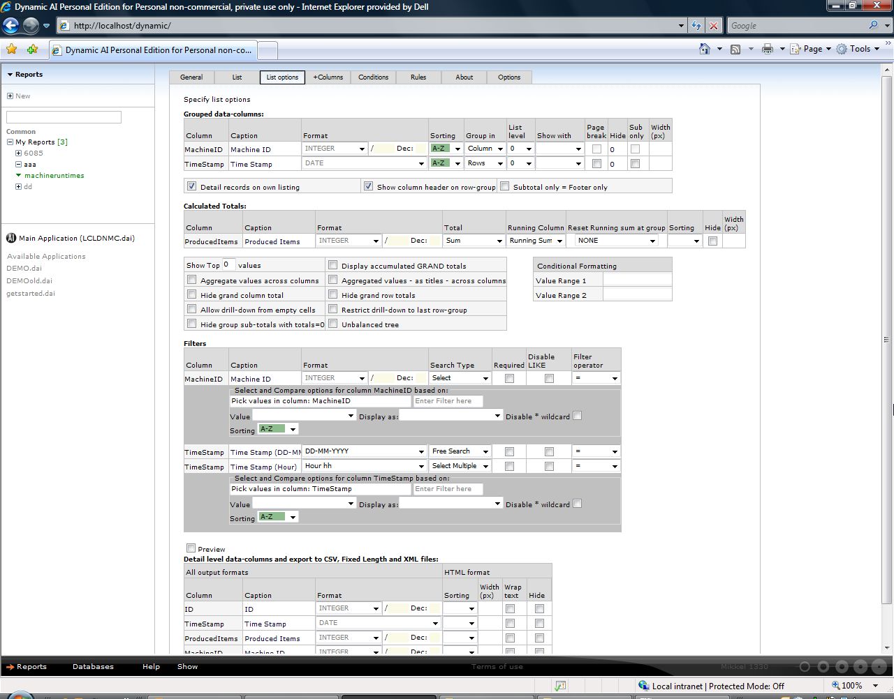
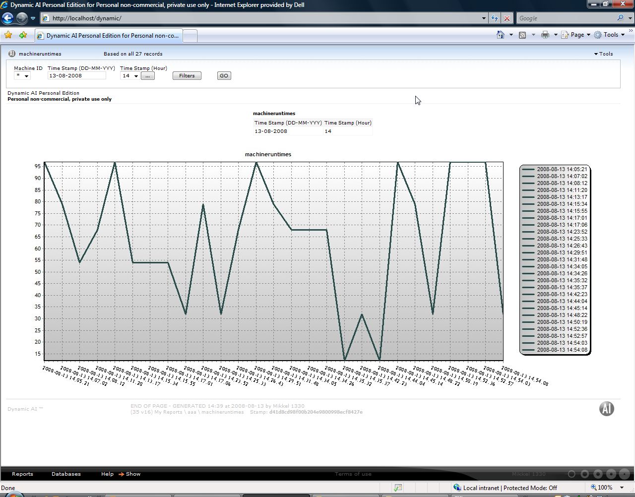
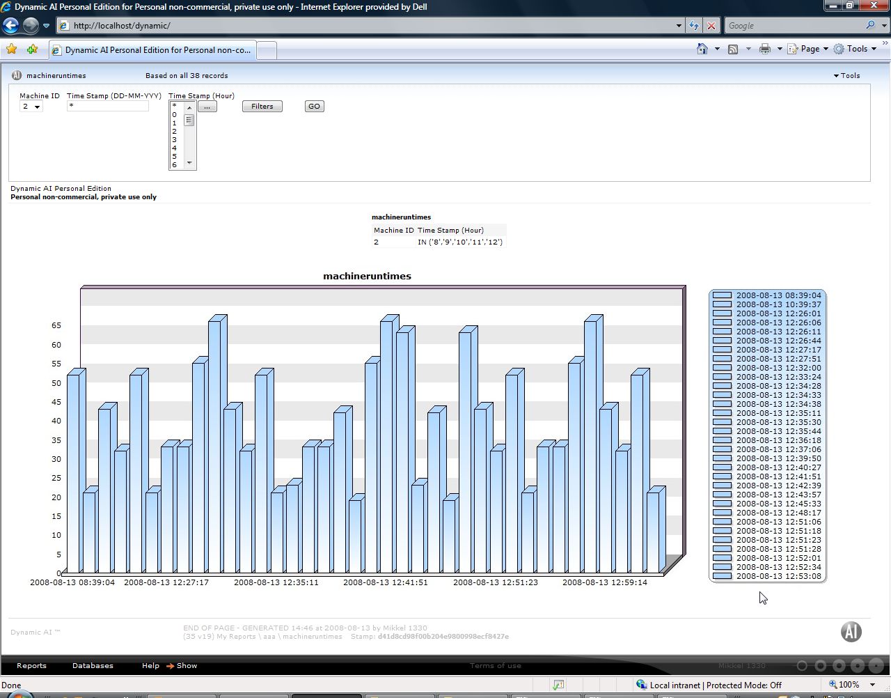
Based on that table I design a report as shown below:
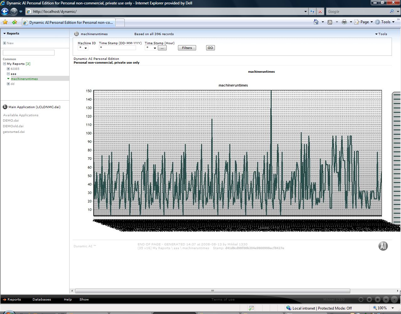
Which gives shows this report when executed:
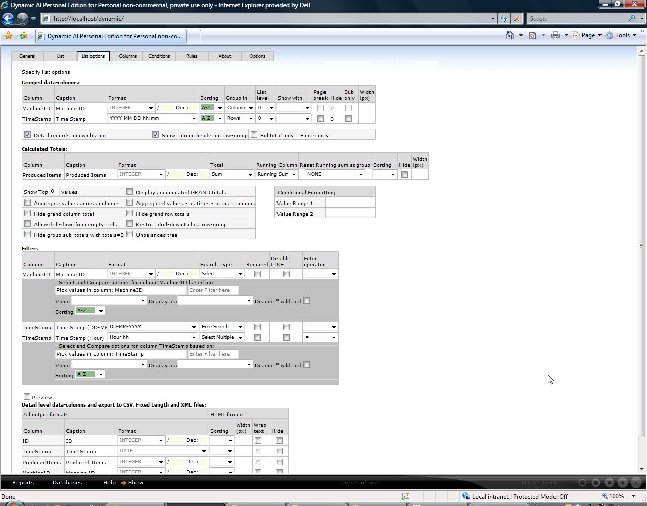
In the personal edition you can choose between different predefined charts. In the Server Edition you can freely modify Chart templates (i.e. hide legend or set interval on shown x-values on the axes) in order to fit a specific report.
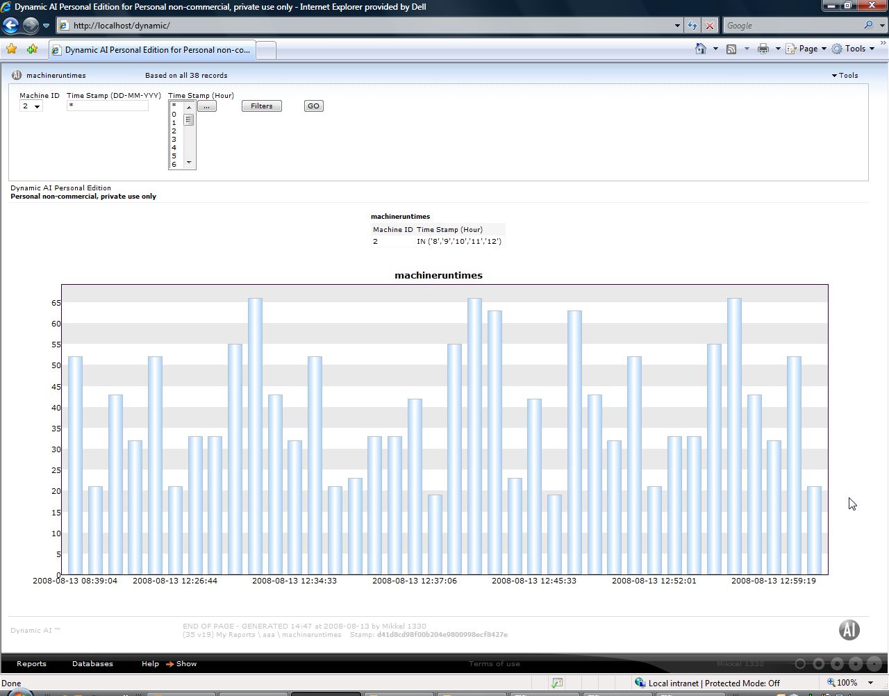
I have used a personal edition in these samples and can see that there might at this time be missing a template that perfectly matches the needs for this report. But however when you start filtering the report it get much more useful:
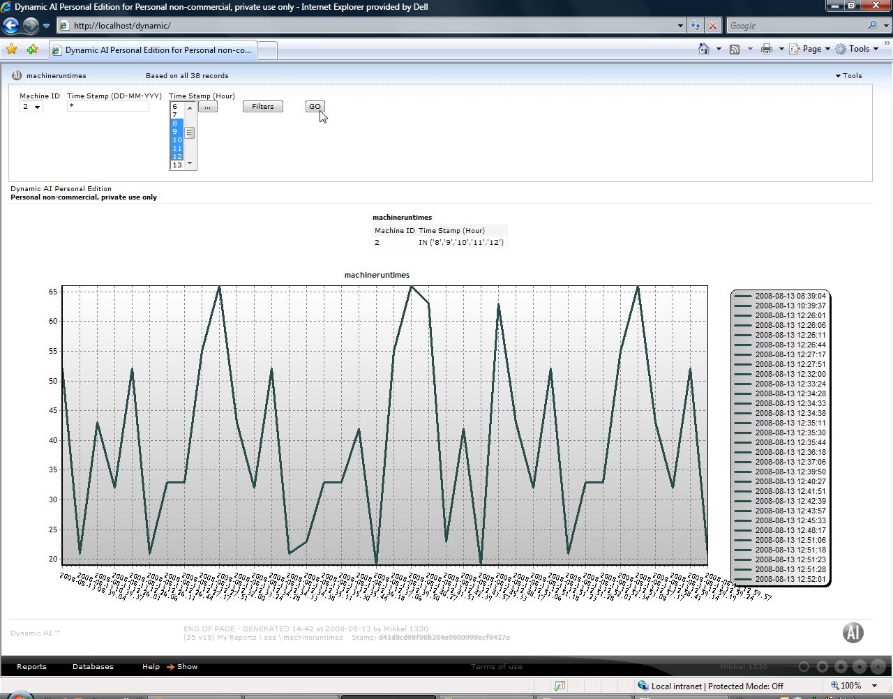
Examples of other charts templates already available:
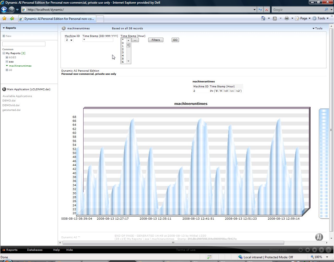
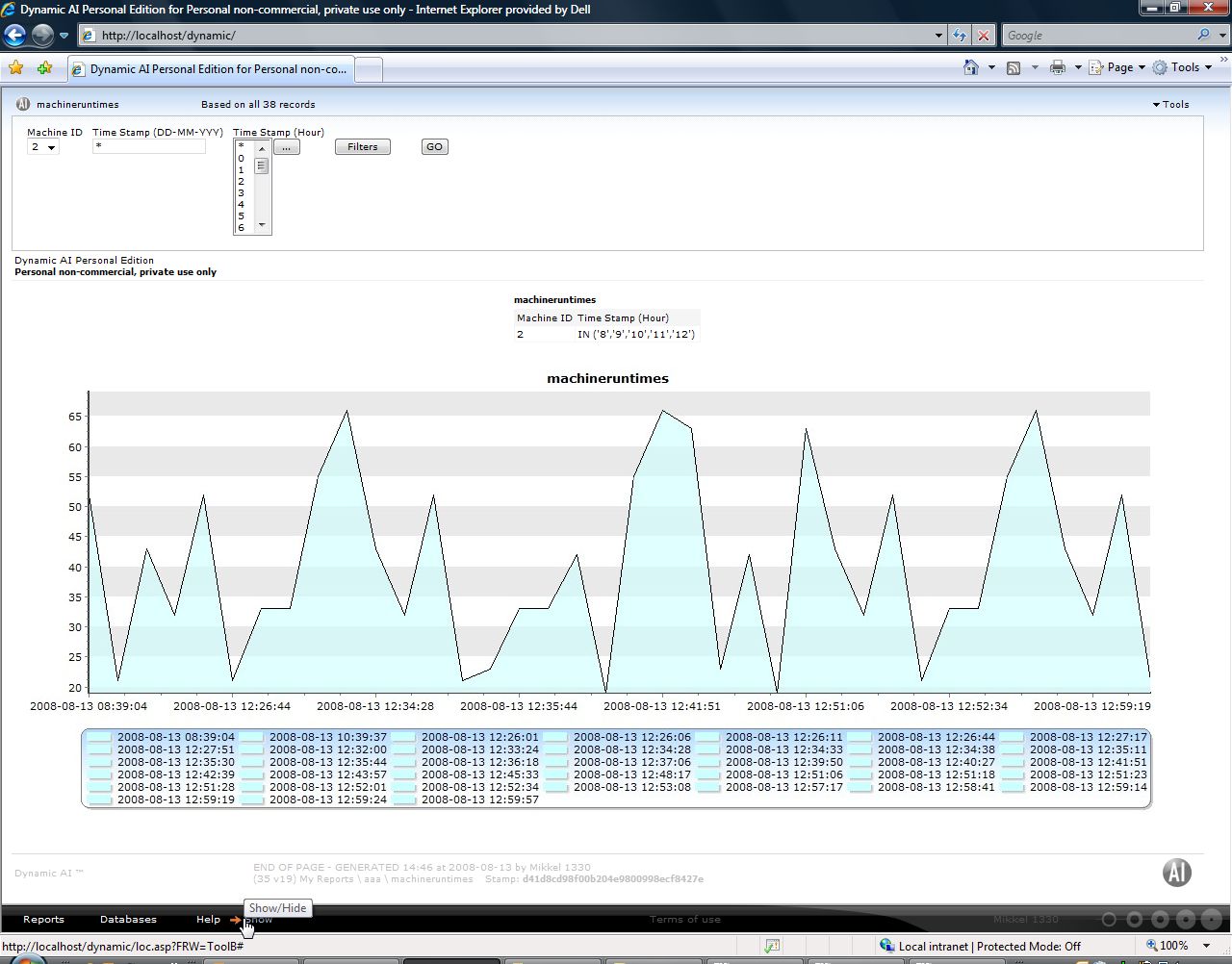
You said you had the data at 1 minute intervals. For that purpose you can use the functionality of formatting the timestamp as shown below:
This gives the below result:
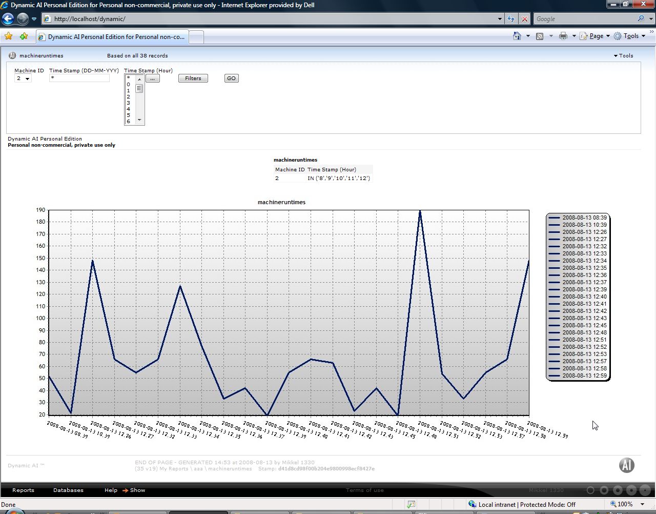
Hope the above example can give you some inspiration to create your report.
Regards,
Mikkel
I have created a sample table holding information of timestamp, machine ID and number of produced items.
The table looks like this:
Based on that table I design a report as shown below:
Which gives shows this report when executed:
In the personal edition you can choose between different predefined charts. In the Server Edition you can freely modify Chart templates (i.e. hide legend or set interval on shown x-values on the axes) in order to fit a specific report.
I have used a personal edition in these samples and can see that there might at this time be missing a template that perfectly matches the needs for this report. But however when you start filtering the report it get much more useful:
Examples of other charts templates already available:
You said you had the data at 1 minute intervals. For that purpose you can use the functionality of formatting the timestamp as shown below:
This gives the below result:
Hope the above example can give you some inspiration to create your report.
Regards,
Mikkel
-

Mikkel Jensen - Posts: 44
- Joined: Fri Sep 21, 2007 1:41 pm
- Location: Copenhagen, Denmark
![]() by shearerg » Thu Aug 14, 2008 3:10 am
by shearerg » Thu Aug 14, 2008 3:10 am
Mikkel,
Thanks so much for your reply. Using it I have had managed to produce the graph I described ... but there are still problems ....
As I mentioned, the data I have is quite raw, actually machine runspeed and timestamp recorded at 1 minute intervals, so there is no real summing, averaging or similar to do on the data, which appears necessary for the graphing facility. Intention is just to provide a zero referenced speed runchart over nominated periods. Anyway, I thought this wouldn't be a problem, as I simply nominated to apply MAX to the minute interval runspeed figures.
I found this generally works ok .... except when the runspeed is 0.0, that is, when the machine is stopped. In this situation, no value (blank) is shown in the associated report, and the graph will not generate. So in short, I can produce a speed runchart for a given time period only if the machine runs continuously. Unfortunately this is not generally the case for our machines, hence the value of a runchart. Must say that the appearance of the blank maximum values in the report has taken me rather by surprise. A simple report looking at the raw data shows data values of 0.0 ok. Appears the maximum value of 0.0 is not defined?
Some other issues I've encountered, atleast with features available with the personal edition:
- Although wanting to use minute-by-minute data, labelling on the x-axis becomes very crowded and generally unreadable. I can't see a way of indicating that just 'enough' labels are required, regardless of the number of data points involved.
- If a machine does run continuously for an extended period, the graph auto-scales the y axis and only shows the runspeed variation. This might be ok, but not what is generally wanted for a speed runchart. I can't see a way of specifying a fixed minimum value (say 0) for the y axis.
Once again, thanks so much for your reply, as it has helped me understand the graphing mechanism. Unfortunately it seems to me that the particularly basic requirement I have may not be ideally suited to DAI. Please, if you have any other advice it will be greatly appreciated.
Regards and thanks,
Greg Shearer
PS
I would attach some relevant images but can't quite understand how to achieve this in the editor.
Thanks so much for your reply. Using it I have had managed to produce the graph I described ... but there are still problems ....
As I mentioned, the data I have is quite raw, actually machine runspeed and timestamp recorded at 1 minute intervals, so there is no real summing, averaging or similar to do on the data, which appears necessary for the graphing facility. Intention is just to provide a zero referenced speed runchart over nominated periods. Anyway, I thought this wouldn't be a problem, as I simply nominated to apply MAX to the minute interval runspeed figures.
I found this generally works ok .... except when the runspeed is 0.0, that is, when the machine is stopped. In this situation, no value (blank) is shown in the associated report, and the graph will not generate. So in short, I can produce a speed runchart for a given time period only if the machine runs continuously.
Some other issues I've encountered, atleast with features available with the personal edition:
- Although wanting to use minute-by-minute data, labelling on the x-axis becomes very crowded and generally unreadable. I can't see a way of indicating that just 'enough' labels are required, regardless of the number of data points involved.
- If a machine does run continuously for an extended period, the graph auto-scales the y axis and only shows the runspeed variation. This might be ok, but not what is generally wanted for a speed runchart. I can't see a way of specifying a fixed minimum value (say 0) for the y axis.
Once again, thanks so much for your reply, as it has helped me understand the graphing mechanism. Unfortunately it seems to me that the particularly basic requirement I have may not be ideally suited to DAI. Please, if you have any other advice it will be greatly appreciated.
Regards and thanks,
Greg Shearer
PS
I would attach some relevant images but can't quite understand how to achieve this in the editor.
- shearerg
- Posts: 62
- Joined: Wed Aug 13, 2008 1:04 am
- Location: Newcastle, Australia
![]() by Mikkel Jensen » Thu Aug 14, 2008 2:01 pm
by Mikkel Jensen » Thu Aug 14, 2008 2:01 pm
Hi Greg
Feel free to email me some screenshots at msj@cintac.com and I will take a look at them in order to solve the issues.
Regards,
Mikkel
Feel free to email me some screenshots at msj@cintac.com and I will take a look at them in order to solve the issues.
Regards,
Mikkel
-
Mikkel Jensen - Posts: 44
- Joined: Fri Sep 21, 2007 1:41 pm
- Location: Copenhagen, Denmark
4 posts
• Page 1 of 1