Chart Variations
On reports with charts, there are four different ways the chart can be filled with the values from the report. In the English language Dynamic AI, these are called:
X-axis=Columns Values=totals
X-axis=Rows Values=totals
X-axis=Columns series=rows
X-axis=Rows series=columns
This document provides samples and explains the 4 different types - the report shows the same data in all cases.
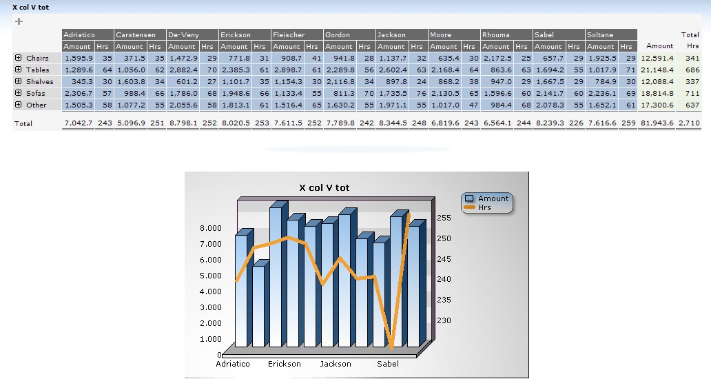
X-axis=Columns Values=totals
This option shows the column-grouped data on the x-axis, and the calculated total for each column as data.
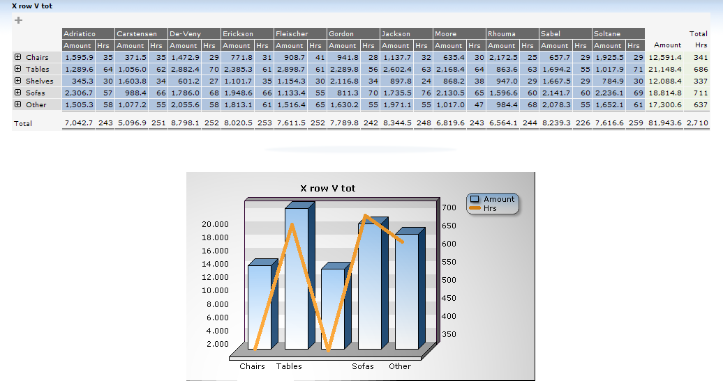
X-axis=Rows Values=totals
This option shows the row-grouped data as the x-axis, and the calculated total for each column as data.
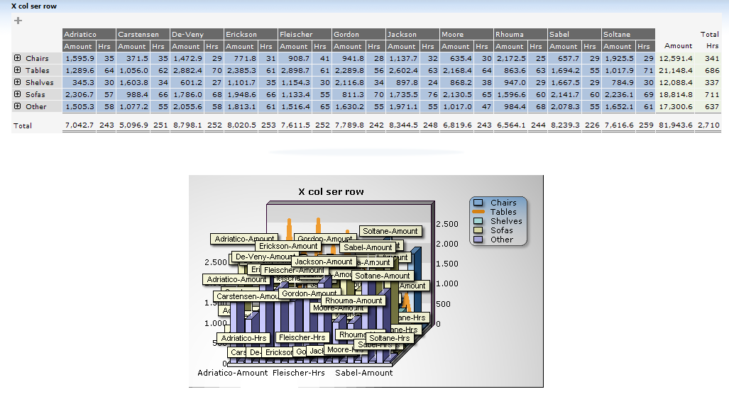
X-axis=Columns series=rows
This option shows the column-grouped data on the x-axis, and the value of each cross-tabbed sum as data.
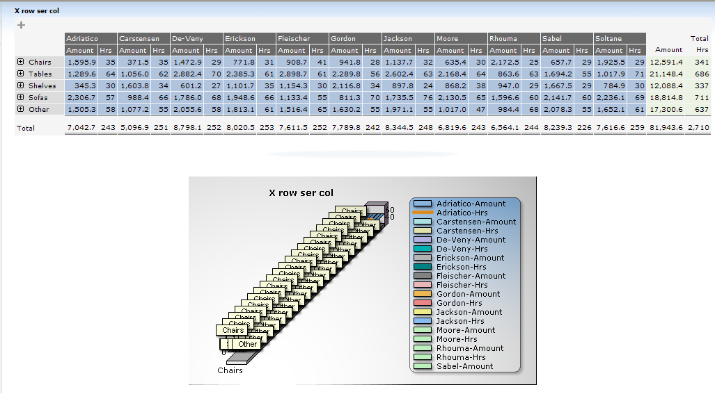
X-axis=Rows series=columns
This option shows the row-grouped data on the x-axis, and the value of each cross-tabbed sum as data.
X-axis=Columns Values=totals
X-axis=Rows Values=totals
X-axis=Columns series=rows
X-axis=Rows series=columns
This document provides samples and explains the 4 different types - the report shows the same data in all cases.
X-axis=Columns Values=totals
This option shows the column-grouped data on the x-axis, and the calculated total for each column as data.
X-axis=Rows Values=totals
This option shows the row-grouped data as the x-axis, and the calculated total for each column as data.
X-axis=Columns series=rows
This option shows the column-grouped data on the x-axis, and the value of each cross-tabbed sum as data.
X-axis=Rows series=columns
This option shows the row-grouped data on the x-axis, and the value of each cross-tabbed sum as data.