Page 1 of 1
Using legend in High Charts

Posted:
Mon Mar 12, 2012 5:32 pmby cavillafuerte
I have created a report which shows average grade mark for a specific subject for schools for previous school years. The report has a single filter where you can select a single school or multiple schools so you can compare them to each other. The problem I am running into is that when I select multiple schools, the graph can be a bit messy looking with the selected schools scoring similar grades. I would like to add a legend and have each series be a different color so it is easier to distinguish on the chart. I have gone into the Rules tab and added the javascript to enable legend but when I run the report, the legend still does not show up.
Re: Using legend in High Charts

Posted:
Mon Mar 12, 2012 5:53 pmby cavillafuerte
I got the color for each different series fixed now. I had some javascript in the Rules tab that was overiding this option but I still can't get a lengend to show.
Re: Using legend in High Charts

Posted:
Tue Mar 13, 2012 3:58 pmby cavillafuerte
Anyone know why the legend would not work on a high chart?
Re: Using legend in High Charts

Posted:
Tue Mar 13, 2012 4:39 pmby cavillafuerte
I have found the reason why the legend will now show up on my high chart. I am using the Conditional Formatting under the List Options tab in order to highlight certain cells that fall within a range. If I remove this conditional formatting the legend appears on the chart. I would like the legend to appear on the chart but at the same time I would like to visually see on the table the values that need attention by being highlighted.
Suggestions? Is this a bug?
Re: Using legend in High Charts

Posted:
Wed Mar 14, 2012 3:13 pmby admin
It is not intentional if conditional formatting disables legends on HC charts, so thanks for letting us know.
Until at solution is found, have you tried the other (non-HC) chart types?
Best regards
Bo Andersen
Re: Using legend in High Charts

Posted:
Wed Mar 14, 2012 3:28 pmby cavillafuerte
No, I haven't tried it on other chart types. Having the legend show up was my main goal. Having the legend and conditional formatting is definitely more visually appealing to the end user and would like to achieve that.
Re: Using legend in High Charts

Posted:
Wed Mar 14, 2012 3:46 pmby Bob Cergol
Bo & Carlos,
After re-reading this thread, I remembered some discussion with Carsten about legends when conditional formatting was specified ... so I reviewed my emails. It turns out it was I who suggested hiding the legend!
When the conditional formatting was enhanced to work with with multiple totals having different magnitudes, and then when this was enhanced to extend to charts -- replacing the default colors in the chart with just the 3 colors defined by the conditional value thresholds -- created a problem.
The issue was what to do with the legend. Since colors no longer equated to named totals, but instead to value-based thresholds, the legend made no sense. I voiced the opinion that: "
I think the report itself is sufficient as the legend -- besides hovering the mouse over the bars displays the total. In a chart-only presentation not naming the value ranges would be more an issue. I do think it is important to hide the default legend when the colors are controlled by a value range. It will be confusing to a user to see the legend when it doesn't correlate with the actual graph. "I think these screen shots illustrate the issue and why the lengend was hidden. When a single total can be anyone of 3 different colors -- how can you show a color legend?
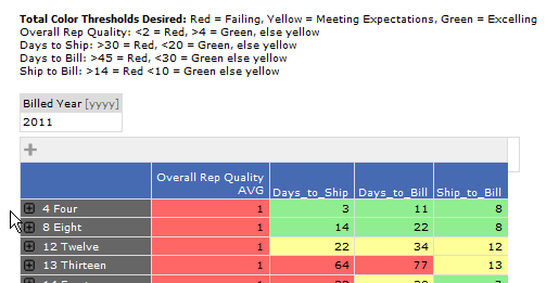
- Chart_Legend_Issue1.png (13.33 KiB) Viewed 109331 times
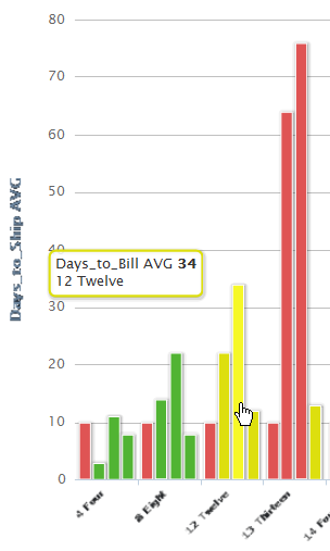
- Chart_Legend_Issue2.png (20.35 KiB) Viewed 109331 times
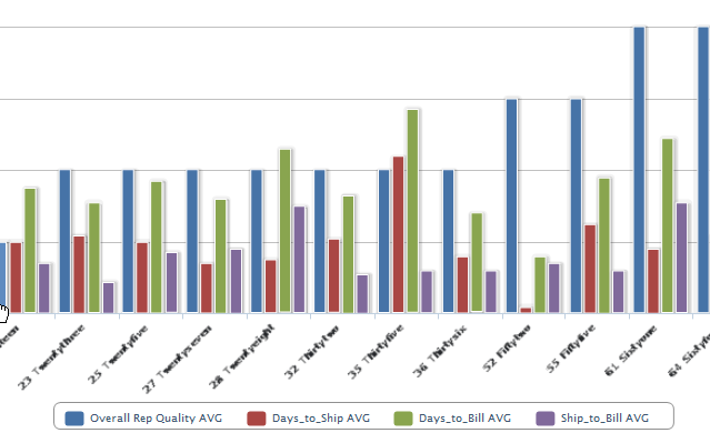
- Chart_Legend_Issue3.png (33.29 KiB) Viewed 109331 times
Bob
Re: Using legend in High Charts

Posted:
Wed Mar 14, 2012 3:59 pmby admin
That makes sense Bob, thanks for enlightening me
Bo
Re: Using legend in High Charts

Posted:
Wed Mar 14, 2012 4:59 pmby cavillafuerte
Re: Using legend in High Charts

Posted:
Wed Mar 14, 2012 5:00 pmby cavillafuerte
Previous post didn't allow me to upload 4th screenshot so here it is.
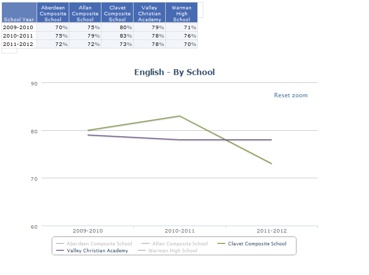
- Chart4.png (21.28 KiB) Viewed 109328 times
Re: Using legend in High Charts

Posted:
Wed Mar 14, 2012 5:38 pmby Bob Cergol
Wow, that's really impressive Carlos!
Did you create the "zoom" funtionality with custom javascript?
Of course in your example there is only a single Total being plotted.
At first look it made sense to me in the case of a single total that the legend should not be suppressed. But then I thought -- if two schools are yellow and three schools are green -- how will the user associate the yellow or green legend with the matching school based on the duplicate colors?
It sounds like what you need is -- when you add your own custom rule -- then the conditional, value-based coloring applied on the report should NOT be applied to the chart. Maybe Cintac can make that happen.
But why don't you just rely on the filter in the report to select just the schools you want to see?
Bob
Re: Using legend in High Charts

Posted:
Wed Mar 14, 2012 6:18 pmby cavillafuerte
Thanks Bob. Yes, I am using custom javascript in the Rules tab to create the zoom functionality.
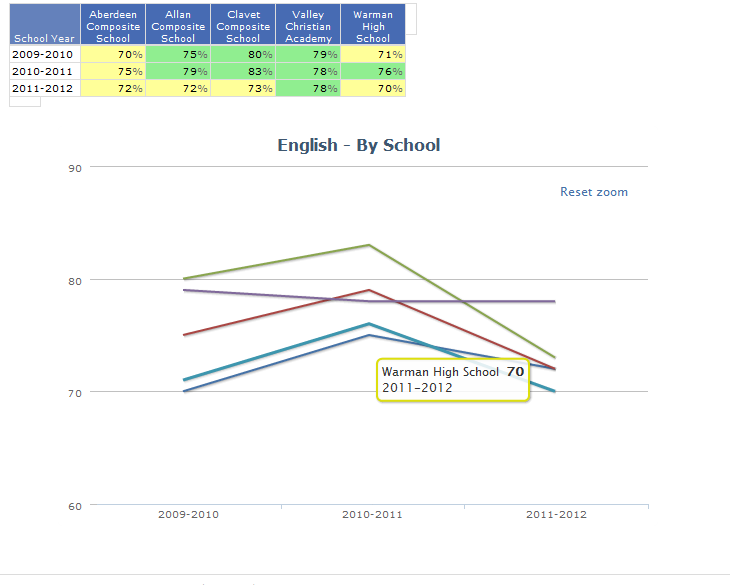
For my report, the table visually shows whether a school is below adequate, adequate or excelling based on the color of the cell. On the chart, the lines are a single color representing the school regardless of the colors of the cells for that particular school. If I hover my mouse over a point for the school, the tooltip box displays the total and the color that is associated with that cell. In my screen shot, you can see Warman High having 2 totals in yellow and 1 in green. The line on the chart for this school is blue but when I hover over point for 2011-2012 you can see the total of 70% in a yellow box which is the color being used in the table. Another issue with my report would be if I wanted to print off the report on a color printer, without the legend it could be difficult to distinguish what the graph is displaying without the legend. Within DAI I can hover over a line and see what school that line is.
- Chart5.png (29.06 KiB) Viewed 109324 times
Re: Using legend in High Charts

Posted:
Wed Mar 14, 2012 6:24 pmby cavillafuerte
Sorry, forgot to answer your last comment about relying on the filter. Using the filter is an option however, if I am working on the results for only the filtered 5 schools in my example and I temporarily want to view 2 of those 5 schools on the graph, using the filter would remove the results of the other 3 schools from the table and the zoom view is also reset. The reason I would like to keep the results up on all the schools is the end user could be in charge of a number of schools, in my example I have 5 schools. I could notice that 2 schools seem to be struggling so I would want to display these 2 schools on the graph only but keep the table with all the schools I am in charge of.