Page 1 of 1
Two series in the same graph

Posted:
Fri Mar 09, 2012 8:41 pmby robinsonky
I want to show this year and next year sales by week in the same graph with this year overlaid on last year. Obviously I can make a temporary table with the two sets of data, but is there a comparative like this built in

Re: Two series in the same graph
Posted:
Tue Mar 13, 2012 5:53 pmby Bob Cergol
Dave,
All of the charts can only plot the actual totals that appear in your report -- either the series or the grand totals -- from either the X or Y axis.
Maybe what you want to do is create a comparison report. For example create a filter on the year part of the order date and set the filter type to one of the "compare" choices. Then group the report on the week part of the order date, etc. The resulting report will show the year-over-year totals by week and the difference. You can then chart the difference in the year-over-year total(s).
bob
Re: Two series in the same graph
Posted:
Thu Mar 15, 2012 4:57 amby robinsonky
pretty sure I don't understand you....

I may be asking the wrong question. I'll try what you suggest and come back with a better example.

Re: Two series in the same graph
Posted:
Thu Mar 15, 2012 10:41 amby Mikkel Jensen
Below example is a graph showing month comparison between 2 years. Is that what you are looking for (with weeks instead of months) ?
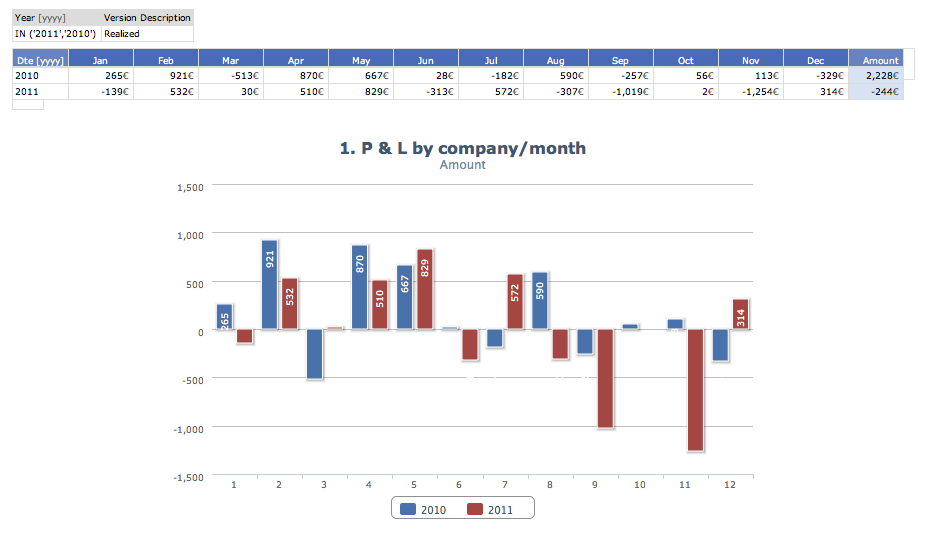
- HC Column, X-axis=Columns series=rows
- Screen shot 2012-03-15 at 10.32.26.png (46.76 KiB) Viewed 63627 times
/Mikkel
Re: Two series in the same graph
Posted:
Thu Mar 15, 2012 10:46 amby Mikkel Jensen
Accumulated and as an area it will look like:
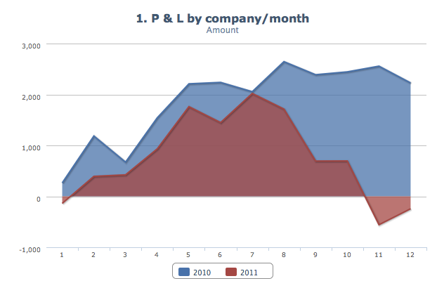
- HC Area
- Screen shot 2012-03-15 at 10.44.53.png (38.7 KiB) Viewed 63627 times
Re: Two series in the same graph
Posted:
Thu Mar 15, 2012 3:46 pmby Bob Cergol
Dave,
I think Mikkel's example is what you really wanted, but for comparison, here's an example of the comparison type report I mentioned. This is done by grouping on Month and filtering on year -- setting the filter type to "compare %".
Bob
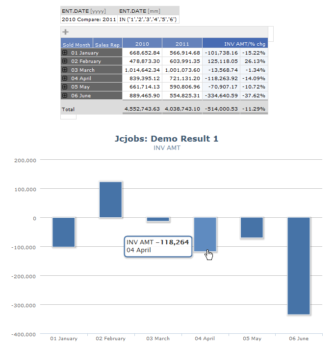
- Yr_Yr_Mo_Comp_Example.png (34.81 KiB) Viewed 63623 times
Re: Two series in the same graph
Posted:
Thu Mar 15, 2012 8:21 pmby robinsonky
Mikkel Jensen wrote:Accumulated and as an area it will look like:
Screen shot 2012-03-15 at 10.44.53.png
that's probably the most like the existing Excel chart, though they use line graphs.
Re: Two series in the same graph
Posted:
Fri Mar 16, 2012 12:12 pmby Mikkel Jensen
Try HC Line

Re: Two series in the same graph
Posted:
Fri Mar 16, 2012 5:22 pmby robinsonky
Mikkel Jensen wrote:Try HC Line
Yup, Thanks, found it in the online demo (which I had completely forgotten) about an hour ago

I realise this is 'Advanced DynAI' but How do I edit graph templates and colours. Maybe I'm looking in the wrong documentation but I don't see it.
Re: Two series in the same graph
Posted:
Fri Mar 16, 2012 8:20 pmby Bob Cergol
There are two ways to do this with the "High Charts" graphs. [The tee charts can be exhaustively customized via the active-X control.]
1) You can inject javascript using the rules tab to affect the behavior and results of the chart. There's a sample somewhere on these forums. I just can't quite recall where it is -- or what I did with the copy I tried out. I'll look for it ....
2) You can use conditional formatting on the list options tab. If you specify value ranges you are defining two thresholds around which 3 different colors will result. The colors will be red, yellow and green but can be changed in the style sheet. Its pretty simple to try to see the result and there are some other recent posts here with screen shots of the results. When you use this, it also flows through to the chart and instead of auto-assigned colors, the red, yellow, green colors are applied to the rendered totals accordingly.
Bob
Re: Two series in the same graph
Posted:
Fri Mar 16, 2012 8:27 pmby robinsonky
There are two ways to do this with the "High Charts" graphs. [The tee charts can be exhaustively customized via the active-X control.]
Where can I find the docs on this? The docs are brilliant in some places but very high level in others!
Re: Two series in the same graph
Posted:
Fri Mar 16, 2012 9:40 pmby Bob Cergol
The active-X control for the T-Charts is a 3rd party control incorporated into Dynamic AI. All new development is going into the newer interactive charts.
I have been able to do a fair amount of customizing just by trial and error experimenting with the user-interace in the control
But you can download a user guide and tutorial for TeeChart VCL version 8 and tutorial at:
http://www.steema.com/download/vclBTW: that simple example javascript for setting colors on the HighChart is:
Highcharts.setOptions({
colors: ['red','green','yellow']
});
Also look at this forum post:
http://support.dynamicai.com/forum/viewtopic.php?f=3&t=436&p=1170&hilit=highcharts#p1170I found a Word document I made describing some of this, I'll email you.
Bob
Re: Two series in the same graph
Posted:
Fri Mar 16, 2012 10:13 pmby robinsonky
The active-X control for the T-Charts is a 3rd party control incorporated into Dynamic AI. All new development is going into the newer interactive charts.
I have been able to do a fair amount of customizing just by trial and error experimenting with the user-interace in the control
But you can download a user guide and tutorial for TeeChart VCL version 8 and tutorial at:
http://www.steema.com/download/vcl
Do I need the Tchart application to get to the UI?
Re: Two series in the same graph
Posted:
Fri Mar 16, 2012 10:42 pmby Bob Cergol
The Active X control is installed with Dynamic AI in the Windows system32 or SYSWOW32 folder. The file is: Teechart8.ocx .
You just need to set the "graph output" setting to "T Chart Active X" in your user profile on the account tab page. Then when you hover your mouse over the chart in a running report buttons will appear to edit, save, etc. You will have to save the modified chart "as" a new name -- and then select it as the chart to use in the report. Your modified charts will also appear "Styles / Graph Templates" on the Administration page.
On Windows 7 I found I had to change some security setting to allow it to run. I don't remember what it was but remember it was pretty obvious -- probably something like "allow active content" or "active X" etc.
Bob
Re: Two series in the same graph
Posted:
Mon Mar 19, 2012 3:09 pmby admin
Just want to add that you also have to use Internet Explorer (since tChart editor is an activeX component)
If you use FF, chrome, safari, opera or other browsers, Tcharts renders as png.
Best regards
bo